Perkbox
An initial proposal for Perkbox
Thoughts
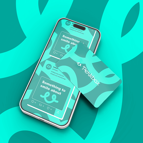
Perkbox is a “fun”, “vibrant”, “energetic” and “positive” brand. But it should also be “personable”, “warm”, “friendly” and “approachable”.
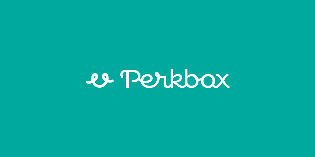
The idea behind the cursive/curly typeface is to play on the personable focus. Being able to have a balance of curved and straight lines adds balance but the cursive pushes a more hand written narrative.
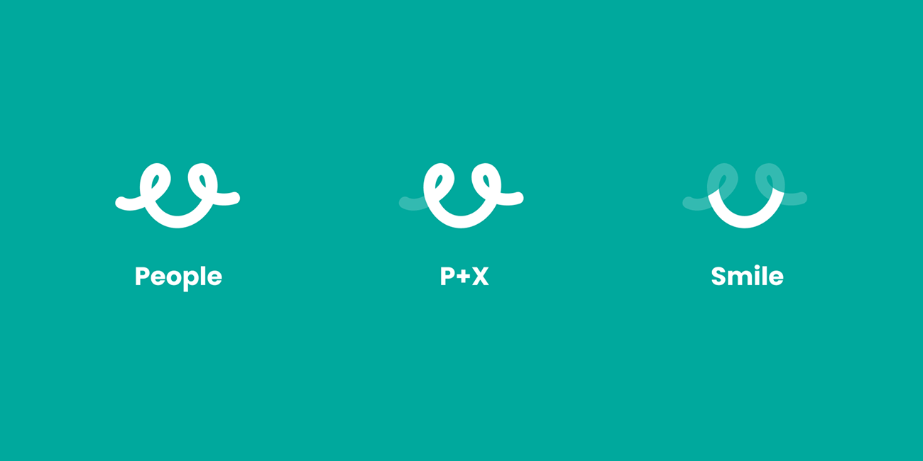
Perkbox wants to be the people’s brand and so the icon focuses on people and happiness.