Project Overview
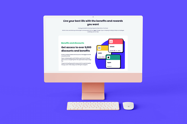
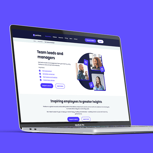
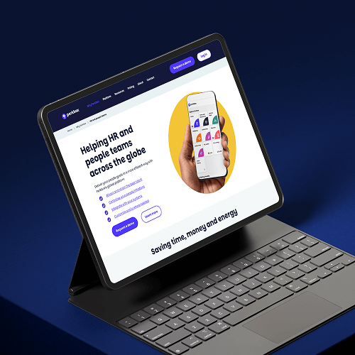
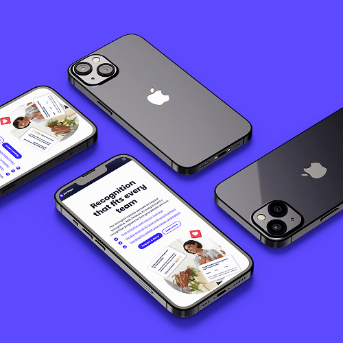
Following a recent brand refresh, Perkbox needed its website to accurately reflect the new visual identity while remaining clear, scalable, and easy to maintain. As a key acquisition and communication channel, the website had to balance strong brand expression with usability, performance, and long-term flexibility.
I was part of the planning team responsible for translating the refreshed brand into a functional, production-ready website. My main focus was on creating a robust UX and UI system that could be consistently implemented, scaled, and maintained across the site.
Objectives
My Role
While the project was collaborative, I had clear ownership over the website’s UX and UI structure.
My responsibilities included:
Being part of the planning and shaping of the website refresh
Solely designing the UX and UI block system used across the site
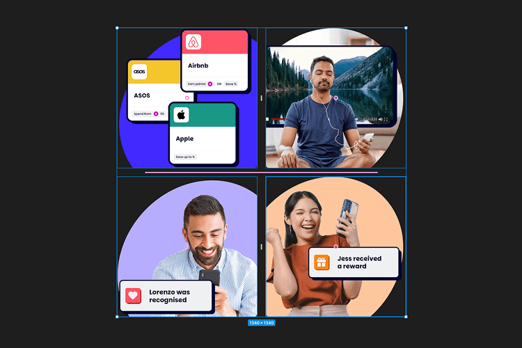
Creating modular, reusable components to support scalability
Liaising directly with the Appfly development team to guide implementation
Producing visual assets to ensure a consistent look and feel aligned with the new brand
Improving briefing, tooling, and handover processes to streamline delivery
Challenge
Brand
New brand means new everything! Prioritising the more important pages and focousing on these allowed for time to be spend on what matters most and less on low reward pages
Time
The rebrand was not finalised until the month of the ebsite lunch, so alot of assumptions and blank UI planning was done with a sprint to the end for the assets and brand style
Dev
Dev needs time and super clear instructions, this meant clear figma boards, lots of notes and great consistent communications and feedback at all times
Collaboration with Appfly
I worked closely with the Appfly development team throughout the project, acting as the main design point of contact.
This involved:
Regular communication to align on feasibility and implementation detailsIterative feedback during build to refine components
Ensuring the final output matched the intended design and user experience
This close collaboration helped reduce friction, avoid misinterpretation, and ensure a smoother path from design to production.
Process, Tools & Briefing Improvements
Beyond design output, I focused on improving the underlying tools and processes. I created a business proposal to introduce Figma as the primary design and prototyping tool, enabling effective website prototyping and closer collaboration between teams.
Once adopted, I expanded the use of Figma beyond the core website designs by:
Establishing reusable templates for blog and case study pages
Creating repeatable layouts for common content types
Supporting faster turnaround on recurring briefs through pre-built structures
I also helped improve briefing and handover workflows by introducing clearer documentation and more structured design handovers. This reduced ambiguity between teams and improved overall delivery efficiency.
Monday.com
Communication and planning is key for these massive projects! Monday helped me stay informed and on track with the workload and feedback from the wider team and AppFly
Photoshop
Photoshop was key for the tricky PNG assets the brand wanted to use. Using artboards, a range of ideas and content was made for quick and reusable templates
Figma
Figma was the MVP of this project. Being able to make and plan blocks with easy reaadability for dev was key and soon we moved from photoshop to Figma for templating designs too
Outcome & Impact
The project resulted in:
A cohesive website that clearly reflects the refreshed Perkbox brand
A scalable UX/UI system designed for future growth
Improved collaboration between design and development teams
Faster, smoother implementation of new pages and content
The website now provides a strong, flexible foundation that supports both brand consistency and ongoing business needs.